True Form
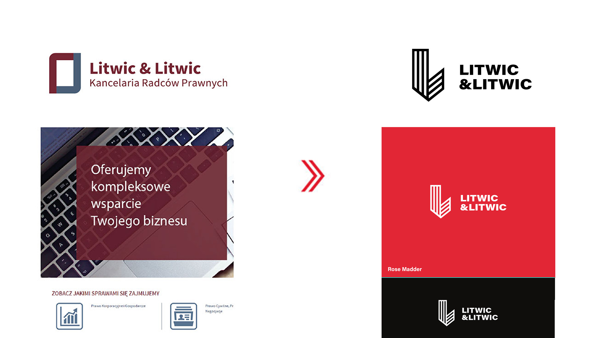
Litwic & Litwic is a Polish law firm offering comprehensive legal services for both individual and business clients. I was responsible for refreshing the brand’s visual identity — including a new logotype, visual system, and redesigned website — to better connect with a new generation of clients while maintaining professional credibility.
My mission:
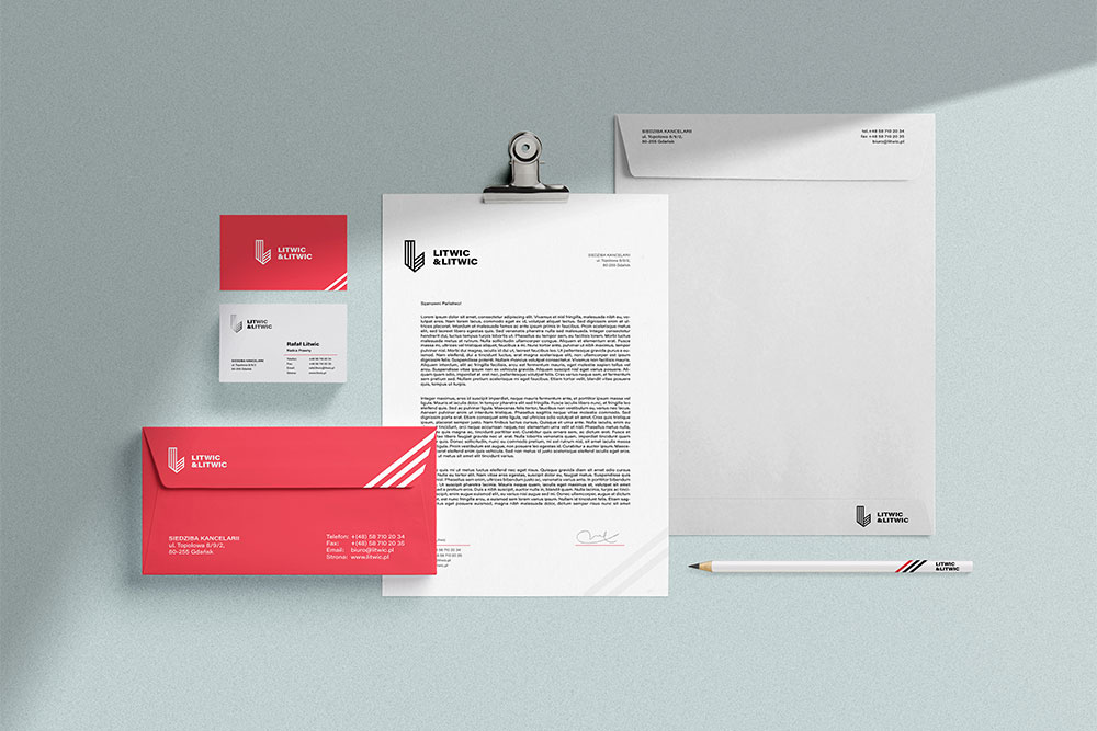
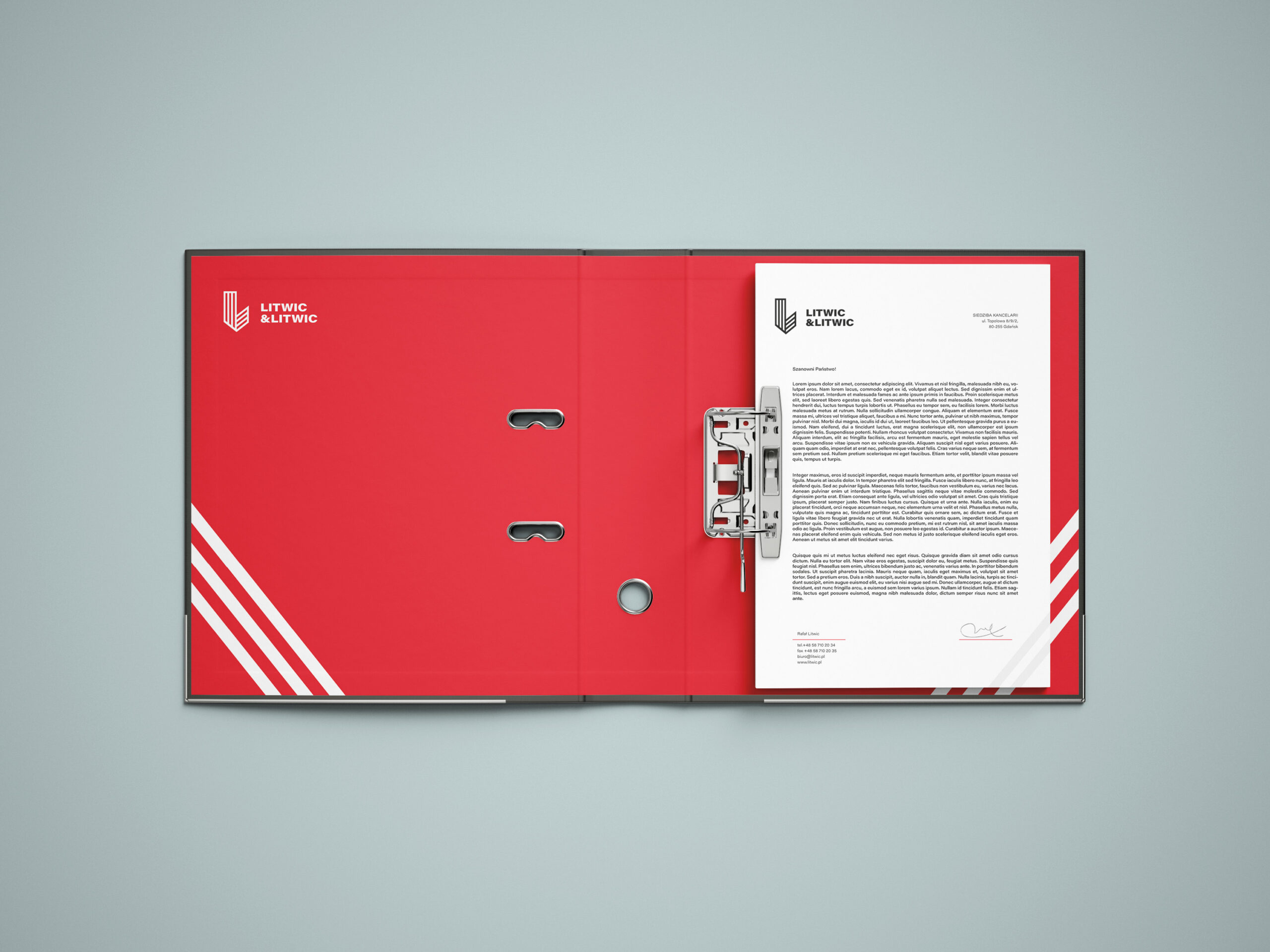
– brand visual
– new logotype
– website redesign
Client:
Litwic & Litwic via Be7 Agency
Refreshing
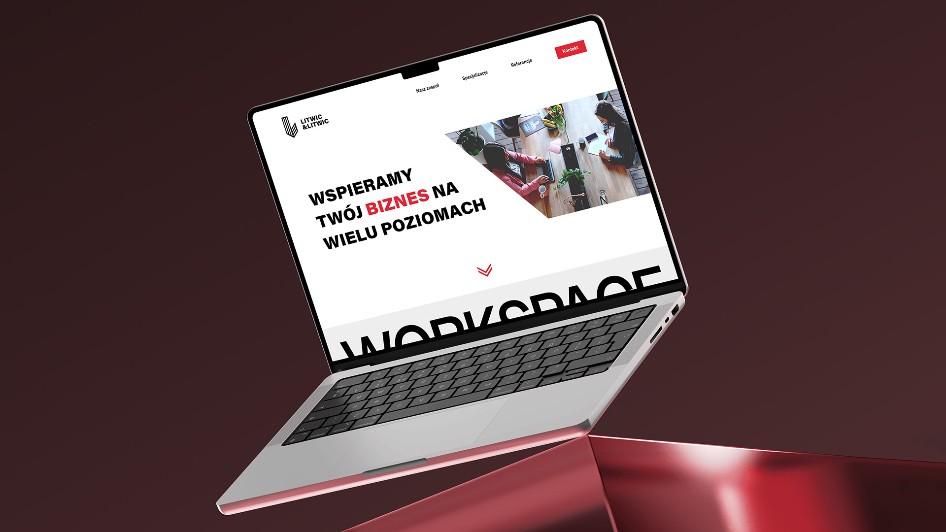
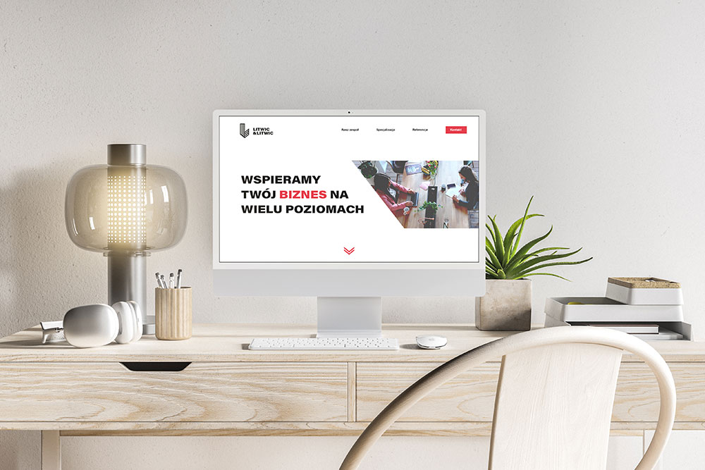
The redesign proposal for Litwic & Litwic was focused on presenting a modern, clear, and approachable attitude toward clients, while maintaining the level of professionalism expected from a law firm. The refreshed identity was designed to reduce distance and formality, helping clients feel more comfortable and confident during their first point of contact.
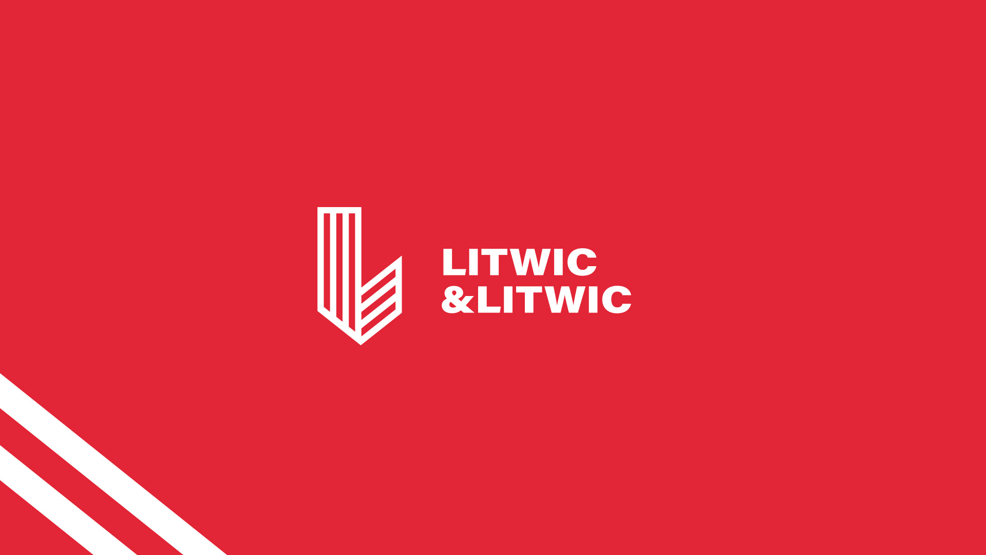
Solid form
The logotype was created with a modernist approach in mind, emphasizing simplicity and an easily recognizable form. Its restrained structure, combined with carefully selected typography, supports a visual language that feels contemporary yet trustworthy.
REDESIGN & WEB
Together, these elements build an image of a law firm that is flexible, client-oriented, and capable of adapting its communication style to individual needs — without compromising credibility or expertise.