care for the beauty
Marion is a trusted Polish beauty brand known for high-quality skincare and cosmetics that support everyday care with effective, accessible solutions. As they celebrate 30 years of growth and connection with their customers, they turned to us to refresh and elevate their visual identity — honoring their heritage while giving the brand a modern, confident look for the future.
My mission:
– refresh brand identity
Client:
Marion via Be7 Agancy
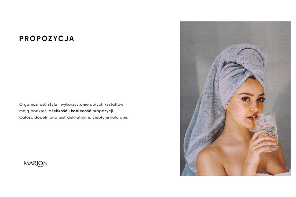
Woman’s touch
.
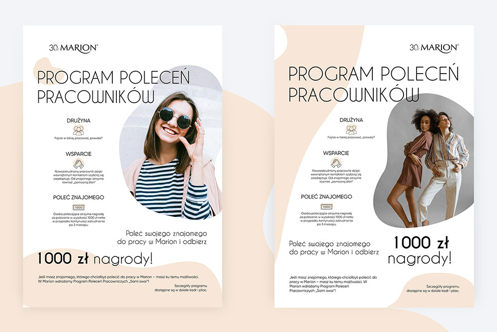
For the 30th anniversary of Marion, the goal was to refresh the brand’s visual identity while respecting its heritage and long-standing recognition. The proposed direction focused on an organic visual language, built around soft, rounded shapes that emphasize lightness, femininity, and a natural sense of flow. This approach allowed the brand to feel more contemporary without losing its warmth and accessibility.
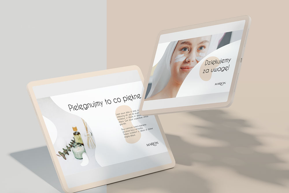
The visual system was completed with a palette of delicate, warm colors, adding emotional softness and cohesion across touchpoints.
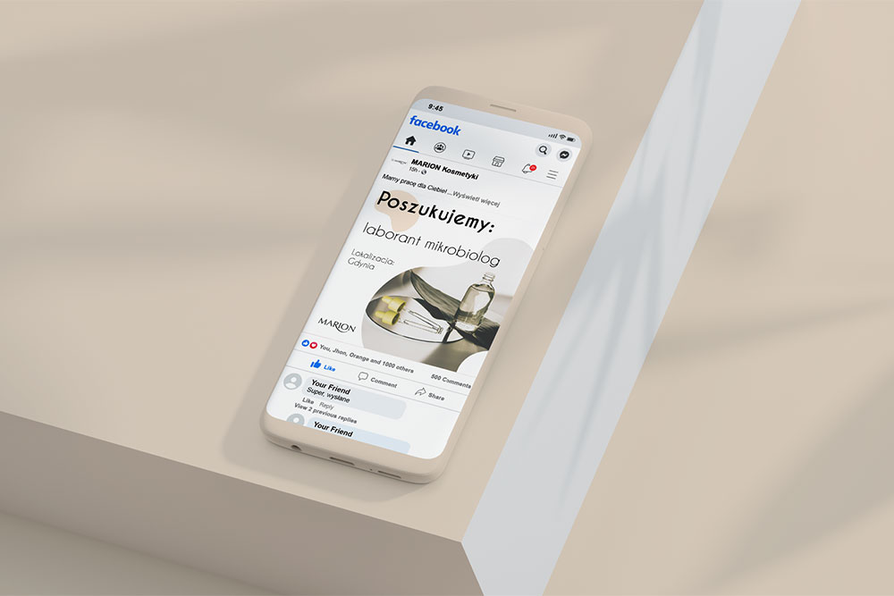
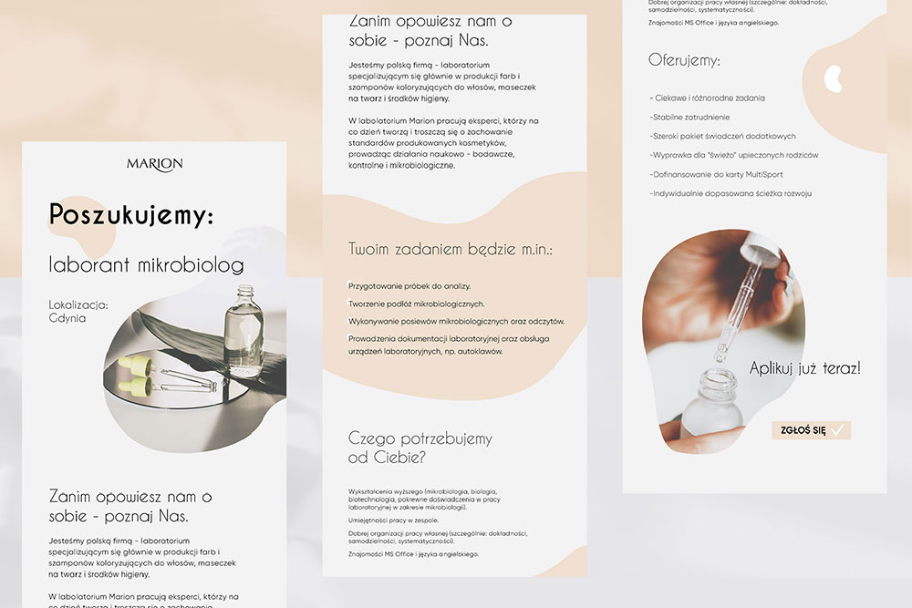
As part of the project, I prepared a range of visual materials dedicated to social media communication as well as internal communication, ensuring consistency and clarity across all channels.
The refreshed identity supports both external brand storytelling and internal alignment, marking the anniversary as a meaningful step forward for the brand.