Set The Sail
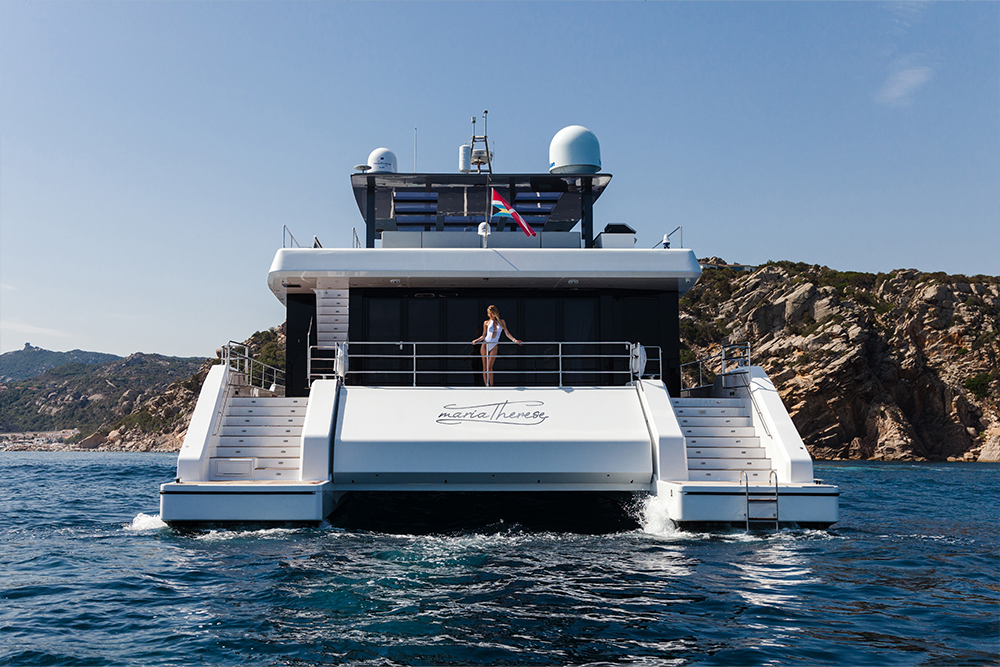
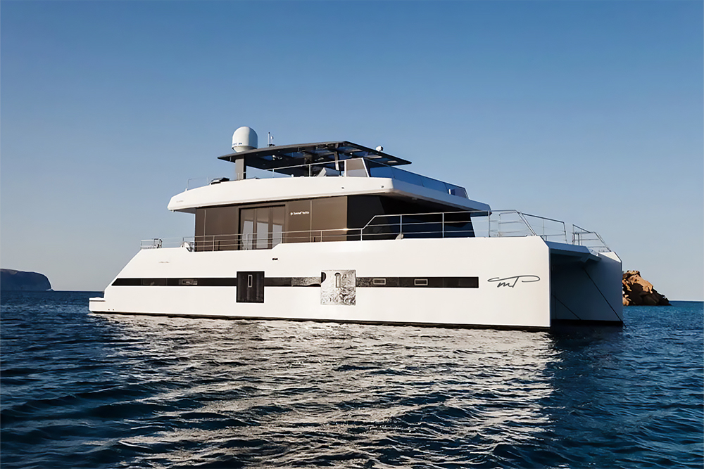
Marie Therese is a bespoke yacht branding project created for a private client building a Supreme 68. I collaborated closely with the owners to design a custom logotype and monogram that reflect a personal story, contemporary elegance, and timeless simplicity.
My mission:
– logotype for yacht
Client:
T J Yachting LLC
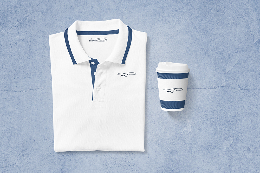
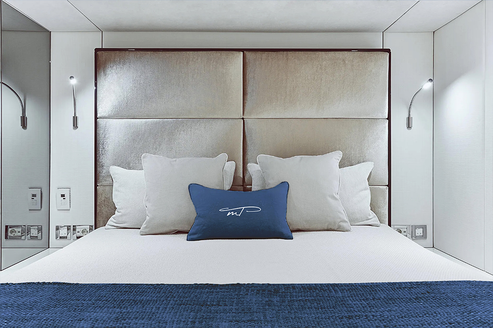
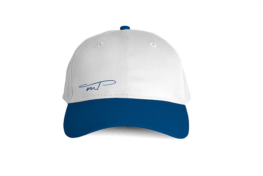
Working closely with the owners, the visual direction was defined by clean forms, restrained elegance, and a refined cursive typographic style. The full name Marie Therese was designed for prominent placement on the garage, while a simplified monogram was developed for the hull, bow, and lifestyle applications such as apparel and onboard textiles.
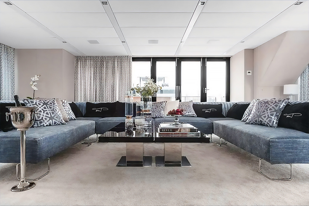
A key element of the identity became the M&T monogram, with a distinctive hierarchy — a subtle lowercase “m” paired with a dominant capital “T.” This typographic contrast added character and uniqueness while remaining understated and luxurious. The color palette was guided by the yacht’s interior concept, spanning contemporary shades of blue from deep navy to light turquoise.